Good morning!
First, I'd like to thank everyone that responded to my blog post earlier this week (through any of my social media accounts) to provide feedback on the cover options for my new novel. I really appreciate all of you taking the time to look through the options and provide constructive feedback. Thank you!!
The following is the vote tally:
Option #1: 5
Option #2: 2
Option #3: 2
Option #4: 6
Option #5: 2
Option #6: 2
As you can see, #1 and #4 were the favorites. But, in both cases, I received suggestions for improving them.
For example, one reader suggested trying different font colors for option #1. Originally, the title was yellow/gold. I sent her 3 more options: black, pale blue, and purple. We agreed that purple was the best choice. What do you think?
Option #1-- Font Color Choices:


With Option #4, several people suggested that I recreate the image using the broken mirror. I created this cover last year-- before I brave enough to sacrifice the mirror in the pursuit of art. (It's such a pretty mirror that I hesitated to break it!). Oh-- and before I could recreate the photograph, I had to reassemble the broken mirror. LOL

Since some time had passed, I wasn't able to position the objects in the photo exactly the same as before but I tried. I used 2 slightly different photos.
Oh! I also decided to play with different fonts. At the moment, these two are my favorites.
Cover Option #4-- With and Without Broken Mirror


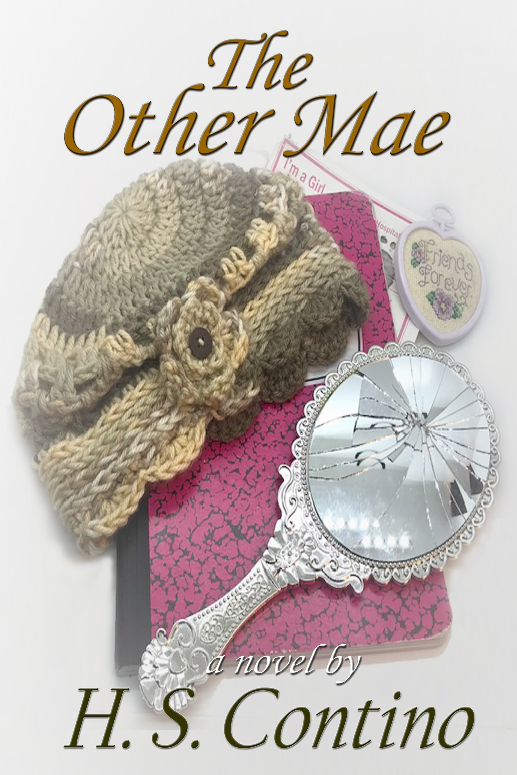
What do you think?
And, me being me, I did some more playing around with both the cover options I shared earlier this week plus a few more. I also added "a novel by" to each of the cover options. So, in addition to #1 and #4 above, there are the following options:
Cover Option #2: I added "a novel by"

Cover Option #3: I adjusted the author name so it's at the same angle as the book title and added "a novel by"

New Options:
Cover Option #7: Just playing with different photograph and background choices. This one also has a wider feathering effect on the edge.

Cover Option #8: For this one, I went with a simpler approach. There's a plain white background and no feathering effect on the edge of the photograph.

And, last but not least--
Cover Option #9: This one uses the same photograph as #7, but a different filter. I also used different fonts and colors. The photograph is also smaller, so the emphasis is on the text.

So, what do you think? I know it's a lot of options... but, it's good to have choices, right?
Thanks again for all of your help. I really appreciate it.
Now to get back to editing the manuscript that goes with these cover choices...
~ H. S. Contino
No comments:
Post a Comment