Good afternoon,
I apologize for not posting any new blog posts lately. I've been busy with projects-- including editing my latest novel, "The Other Mae." I'm making progress, and I plan to self-publish it later this year. But, I'm not feeling confident enough to set a release date yet.
I'm currently between drafts, so I thought I'd spend a few days working on the book cover design. I shared a few options last year, but I didn't love any of them. So I've been playing with additional designs, fonts, font colors, and background images.
The following are my current favorites. What do you think? I'd love some feedback!
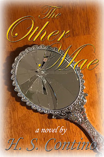
Option #1: I love the swirling font on this one, but I'm worried that it might be too hard to read.
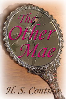
Cover Option #2: I played with placing the title text on top of the mirror in this one. I might adjust the font size and spacing some more.
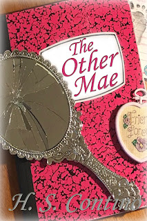
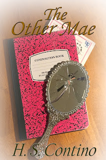
Cover Option #3: For this one, I played with placing the title of the book on top of the journal (which plays a role in the story). I also zoomed in on the background image, so you can't see the other items as clearly. I was hoping that added some mystery. Each item is relevant to the story.
Cover Option #4: This one is from the batch of covers I made last year. I used a feathering effect on the photo edges to make it look a little bit like a watercolor. Overall, I think this cover looks elegant and fits well into the women's literature genre.
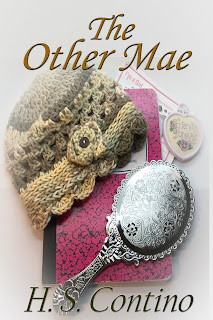
Cover Option #5: This one is similar to some of the other options. I used a feathering effect on the image, but this time I didn't zoom in. Instead, I framed the text around the image.
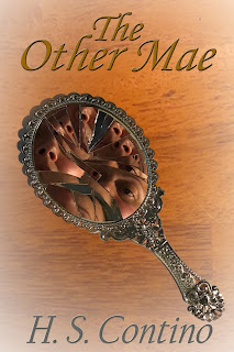
The last cover option (#6) is more experimental, and I'm not sure what I think of it. I was playing with the mirror and distorted images. What do you think?
As always, thank you for taking the time to read my blog. I really appreciate it!
~ H. S. Contino
No comments:
Post a Comment